DSI Software Engineers create interactive map tool to maximize climate investment tax benefits
Tax season is already stressful for individuals, businesses, and even for municipalities. Individual tax-payers are no longer the only ones who are looking for ways to maximize savings and take advantage of federal programs. Historically, local groups like municipal utilities, county governments, and rural electric cooperatives had to use third party organizations to apply for tax credit bonuses. Thanks to the Inflation Reduction Act (IRA), these groups can now apply for these tax benefits directly. However, it can be difficult to know which credits apply and to whom.
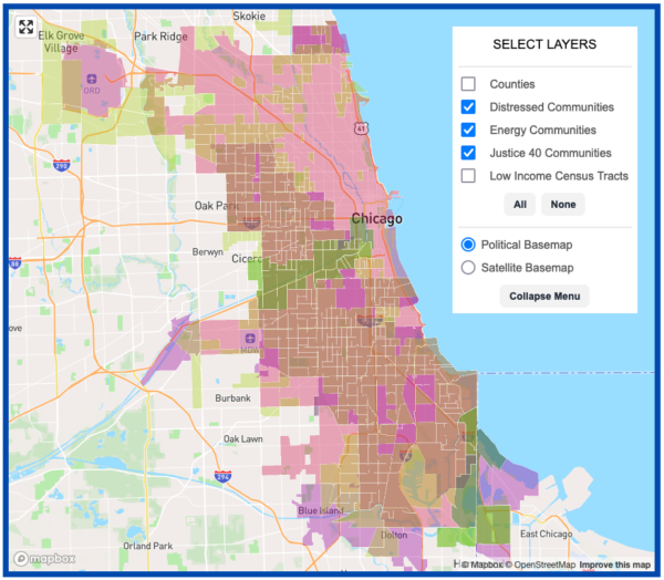
To overcome this uncertainty, The Data Science Institute’s Software Development Core team, with support from the 11th Hour Project, worked with Climate Cabinet Education to help develop a tool that identifies such tax savings. The DSI researchers created an interactive map to help local governments maximize the benefits of the historic federal climate investments from the IRA. Using this new tool, users can track which bonuses they are eligible to receive, and how many residents will be impacted by those savings.
“It can’t be overstated how important an investment the Inflation Reduction Act is to helping communities transition to a green economy, but the funding is only the first part,” said Climate Cabinet Education’s Local Lead Program Director Jeremy Schroeder. “The funding needs to reach these communities. This mapping tool helps communities know what funding is available to them and gives under-resourced communities a place to start.”
Combining data sources and mapping technology to improve access
The IRA is the biggest federal investment in climate in the United States’ history. Pledging an estimated $369 billion for clean energy and climate projects over the next 10 years, the legislation dictates two-thirds of that amount will be distributed through clean energy tax credits.
The passage of the Act provided municipal governments and other local entities the chance to apply directly for tax savings in the form of climate initiatives. Various agencies such as the Department of Transportation and the Internal Revenue Service offer five tax credit programs. These five programs are cumulative, meaning local governments can apply for multiple programs to increase their savings. But all of this information is scattered across different host departments and applies to varying subsets of the US population.
Bringing all of this information together in a single map was the main challenge faced by DSI Software Engineers Launa Greer and Chris Redmond and Data Scientist Todd Nief.

“To reliably construct the geographies used in the tool, we had to build a data pipeline to ingest and standardize roughly 200 input files from the U.S. Census Bureau, the U.S. Department of the Treasury, the U.S. Department of Energy, the U.S. Department of Homeland Security, the Economic Innovation Group, and the Executive Office of the President, among other sources,” said Greer. “Afterwards, we were tasked with mapping these datasets to an actionable format that could be indexed, searched, and visualized quickly by government and rural cooperative leaders.”
The DSI team, led by Greer, started by meeting with the Climate Cabinet Education team to properly scope the needs of this new tool. Close collaboration was critical to the success of the design process.
“It was surprisingly difficult to find authoritative boundaries for cities, townships, and villages, even within census data,” said Greer. “We had to combine several different census datasets together to produce a uniform dataset of municipalities, which Climate Cabinet reviewed for accuracy. They also pointed us to electric retail service district datasets and provided an updated list of utility names to augment the government’s data. As a result, the tool’s end users have access to much more relevant information.”
Working through several iterations, the team designed an interactive map that allows users to search for their state, county, municipality, municipal utility, or rural electric cooperative by name. Once a geography is selected, the map zooms to the region and highlights the geography’s borders and any disadvantaged areas with which it intersects. For example, the tool might highlight low-income census tracts or energy communities affected by coal plant closures. A side panel displays an estimate of the number of people living in the intersections and indicates which of the five tax credit programs might apply for that region.
“To the best of my knowledge, this is one of the first tools to overlay geographic boundaries from different IRA tax credit programs in a single interface,” said Greer. “We hope that civil servants and rural cooperative leaders can use it to find and apply for grants they may not have sought otherwise and ultimately invest in the communities at greatest risk of harm from climate change.”
One of the more difficult data science challenges was including population estimates for each of these regions. The team at Climate Cabinet Education agreed that a core element of creating strong narratives for grant applications is understanding how many people are directly impacted by climate initiatives.
However, assigning population counts to regions isn’t always as easy as simply plugging in census data. While some geographic boundaries, like counties and states, respect census boundaries, others are a free-for-all, like zip codes and municipal utility coverage. “To estimate populations within these regions, we used the population-weighted centroids of census block groups,” said DSI Data Scientist Todd Nief. “We tried several other more computationally expensive methods to estimate population density, but found them too slow to run repeatedly on the entire United States. We needed a good trade-off between accuracy and computation cost.”
The Tax Credit Bonus Map fully states the methodology required to overcome this particular challenge.
Looking to the future
The DSI team is finalizing the project by training the Climate Cabinet Education staff on how to run the infrastructure of the mapping tool and finishing pipeline clean-up before all the assets are passed along to the host site. Schroeder is pleased that the tool has already garnered interest, particularly at the National League of Cities Congressional Conference, where numerous cities expressed their frustration at the inadequate federal tools to help smaller communities.

“We’ve already seen a demand for this mapping tool,” said Schroeder. “The DSI team’s mapping tool did the difficult work of combining multiple tools and data into one interface that a smaller city with less staff and resources could use.”
With the map officially live as of March 2024, Climate Cabinet Education is scheduling workshops to train city managers and other government employees on how to put the tool to use for their specific needs. According to Schroeder, Climate Cabinet has already held two trainings where elected officials and staff were able to identify ways their cities could benefit. “We are now working on state-specific trainings to help cities identify opportunities,” elaborated Schroeder.
With mapping tools driven by data science, perhaps tax season can be just a little less stressful.


Community Data Fellow Stephania Tello Zamudio helps broaden internet access for Illinois residents
PalmWatch, a new tool created by DSI’s 11th Hour Project team, sheds light on palm oil production across the globe

DSI Summer Lab Students Present Wide-Ranging Research